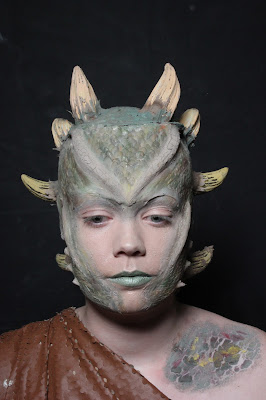
Here are some of my favourite images from my final shoot.
This is my favourite image that I took, as I was able to get most of my look into the image. I asked my model to lift up her hand, so that I could get the scales and colouring of the hands onto the image as well as her face, horns, chest and arm. I really like the composition of this image, as the hand reaching up to the shoulder, and the material that is wrapped around the model lead the viewer's eyes up towards the face of the model. The head is the main part of the image, surrounded by the black background, and then the eye follows back down to the chest and arm. The image also follows the rule of thirds, as the focal point is in the appropriate section. I am pleased with how the scales came out on camera, as they do look really realistic, and the colouring supports this as it brings depth to the look. I am pleased with how the fuller's earth on the head blends into the prosthetic pieces, I think this is mostly down to the colouring, as well as the textures I created on the actual prosthetic pieces. I am not very pleased with the way the fuller's earth has set on the hand, as it didn't crack as much as I wanted it too, which makes it look like I have just used paint and let the paint dry, leading it to crack slightly. The other things that I am not pleased with is the way the prosthetic piece on the forehead set on the eyebrow. Because the piece is a silicone flat mould, it is not extremely flexible, with left the piece bagging over the eyebrow because of where the eye socket goes in. I was not very happy because it makes it look like I haven't blended the piece, when in fact the baldiez is actually below the piece and blended.


No comments:
Post a Comment